Overview
Art Direction
Packaging
Branding
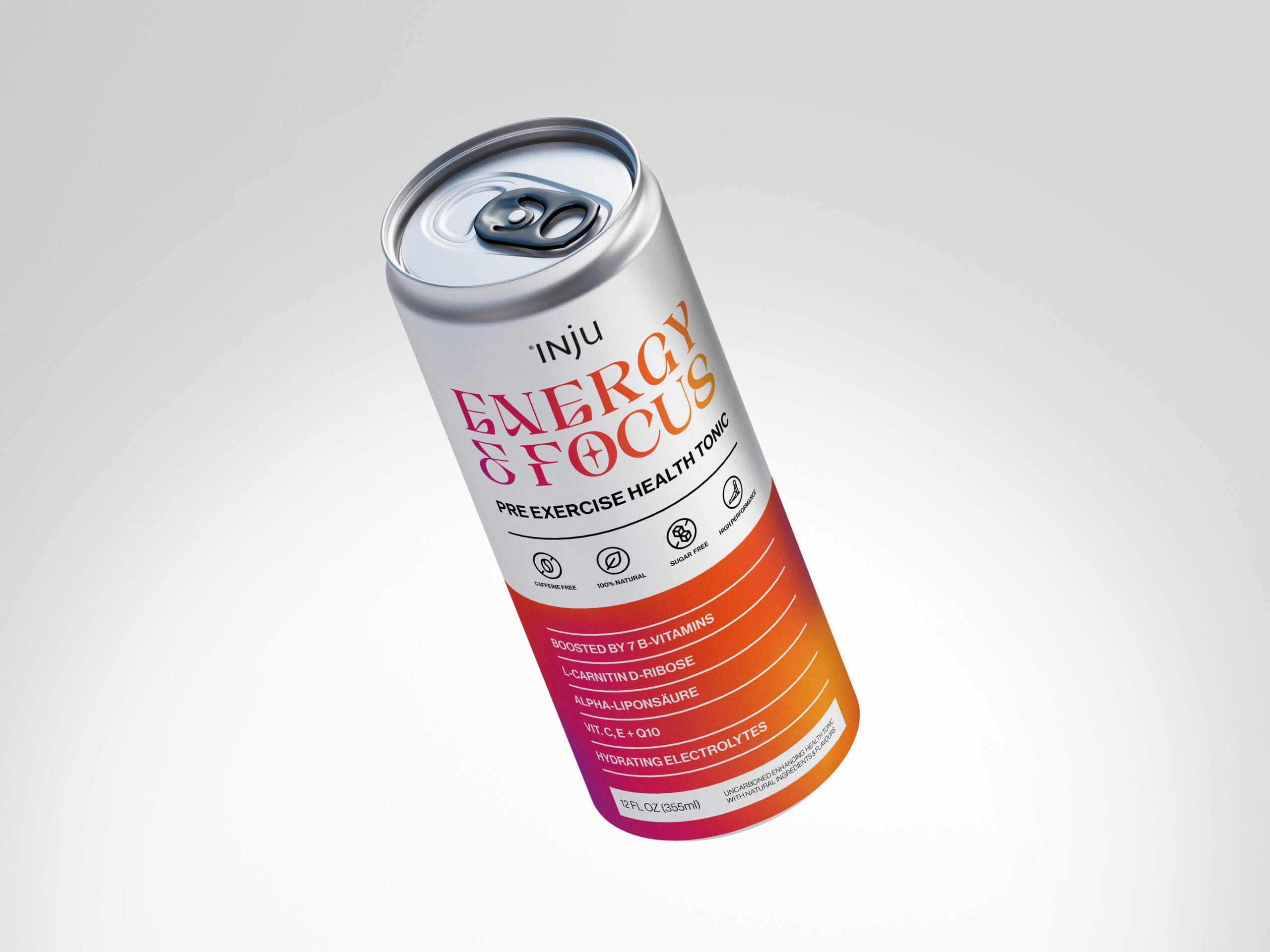
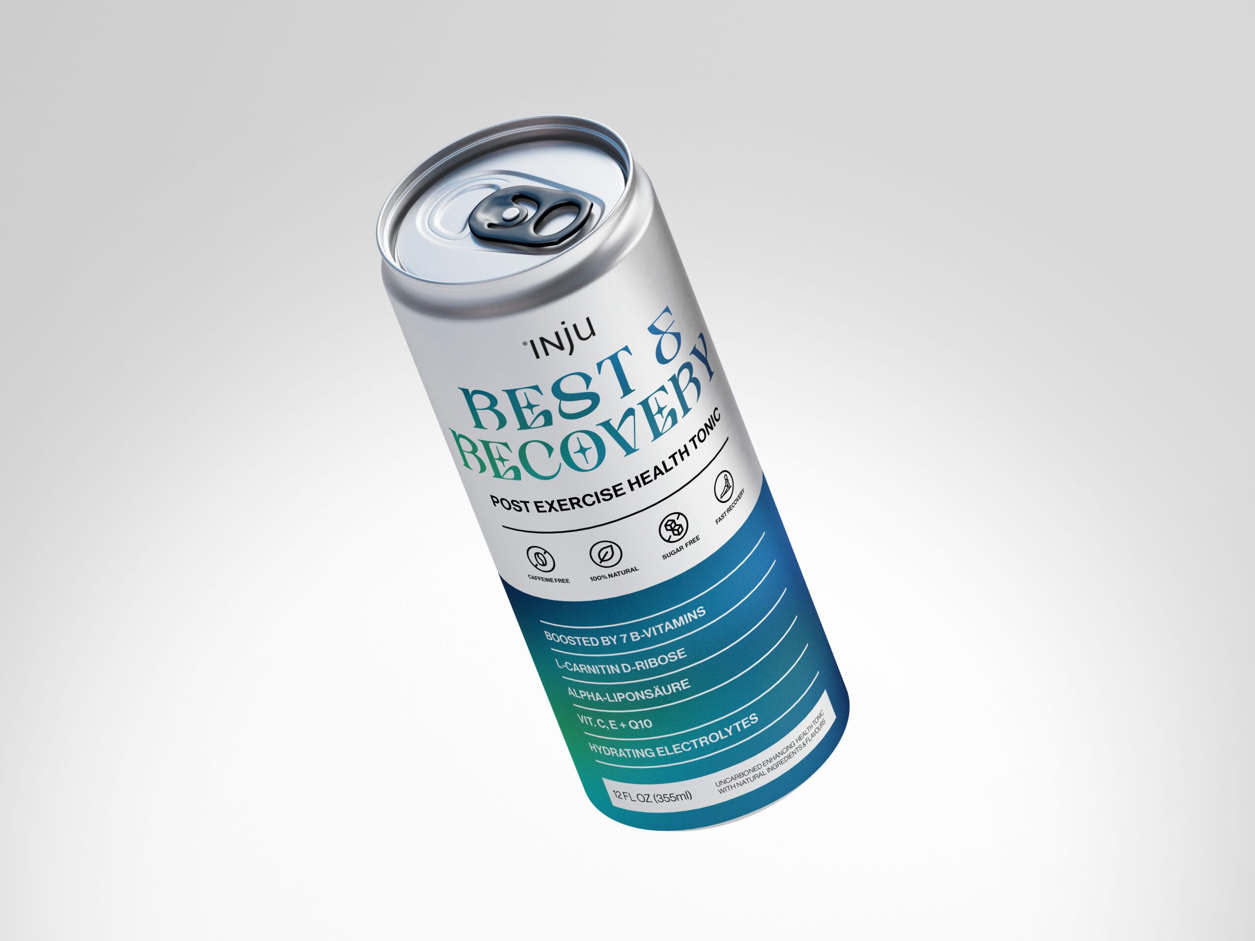
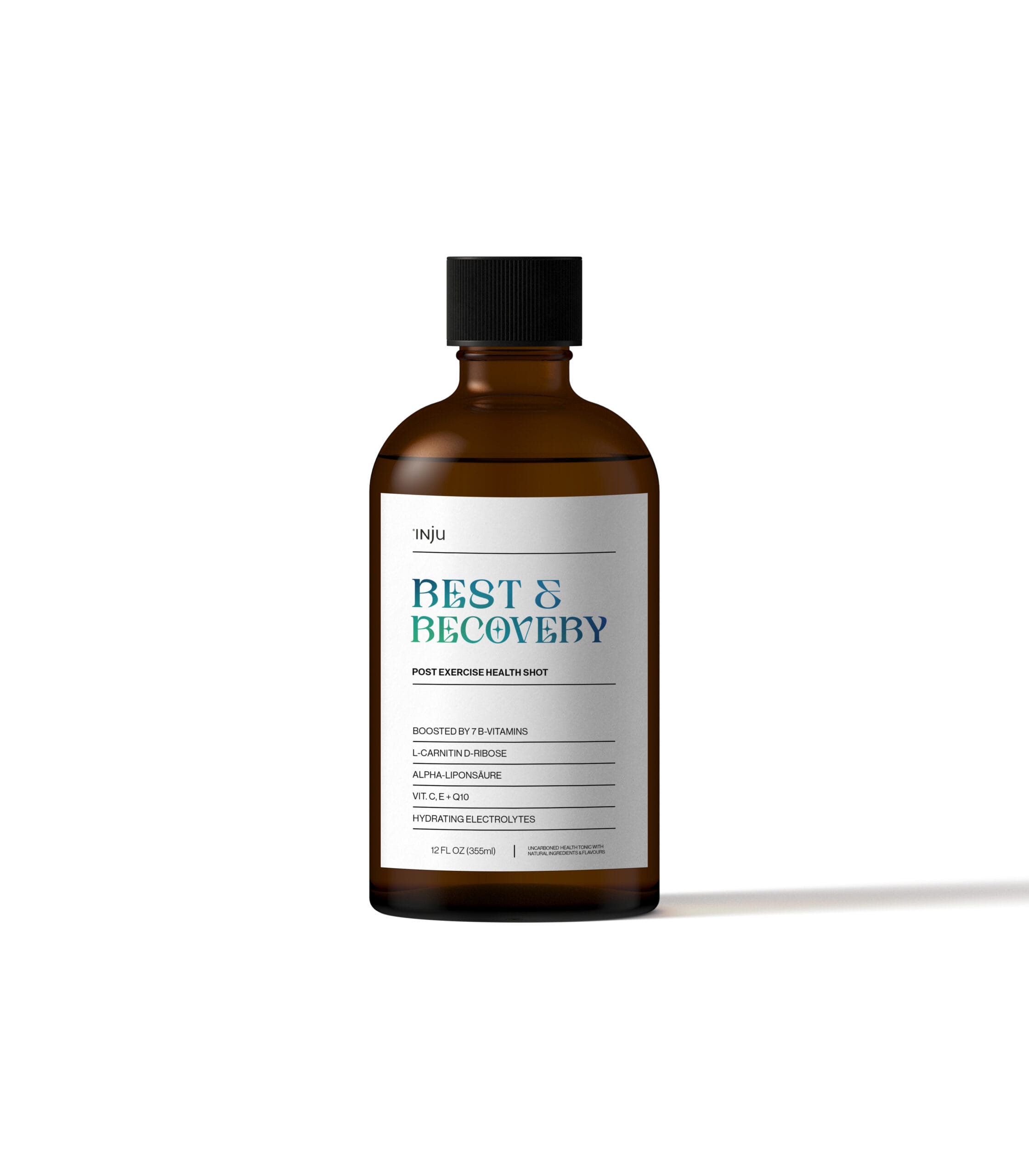
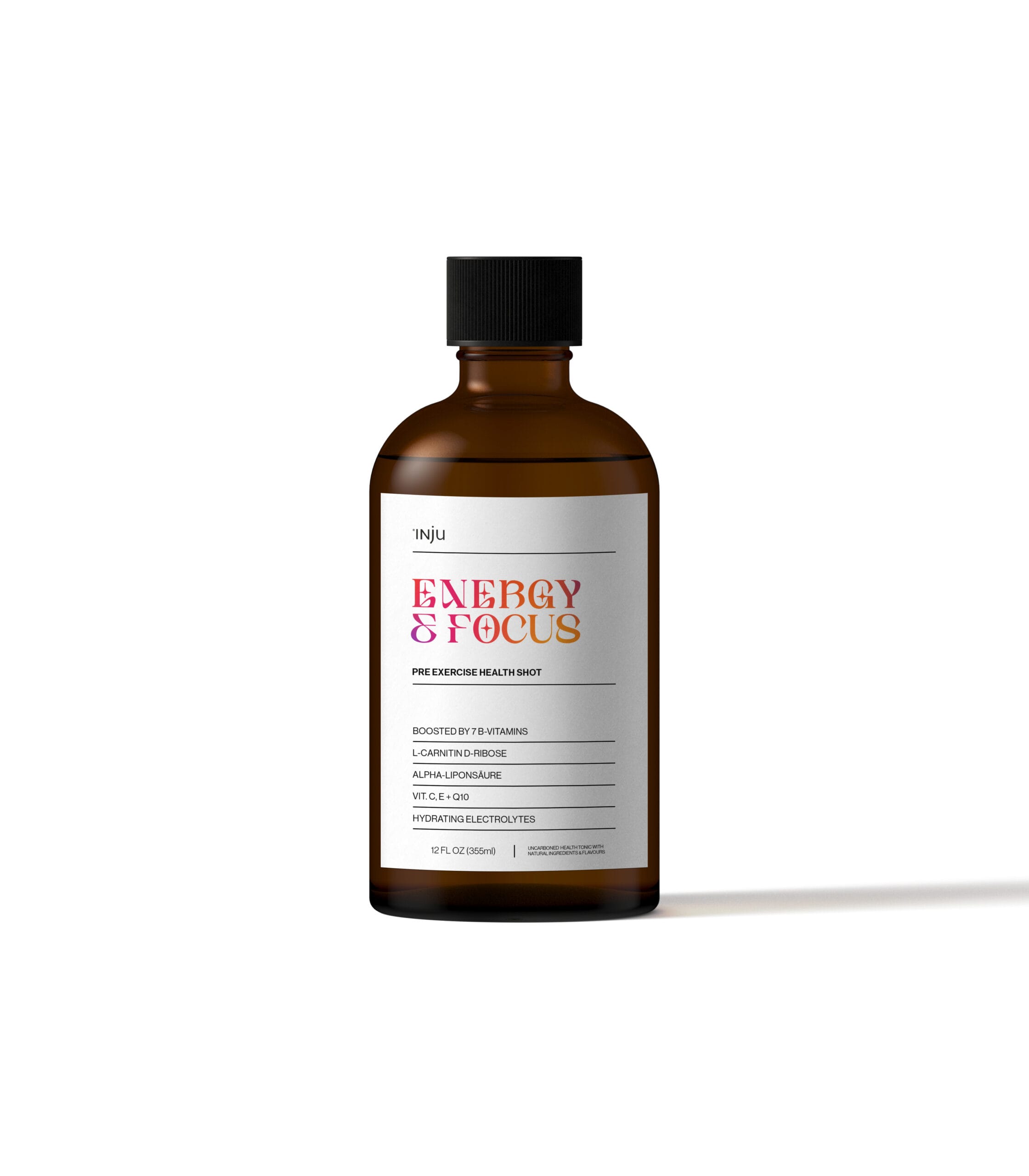
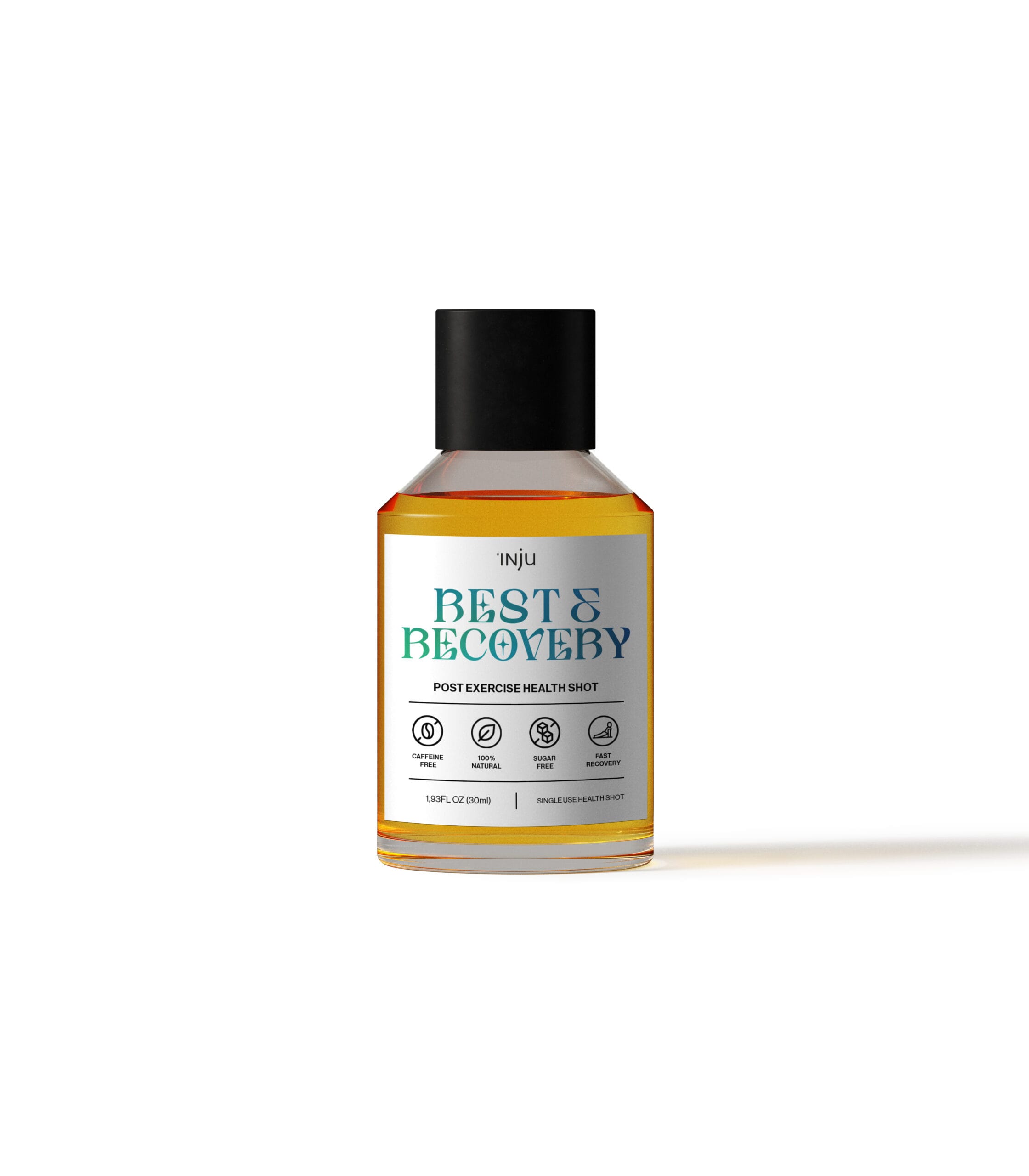
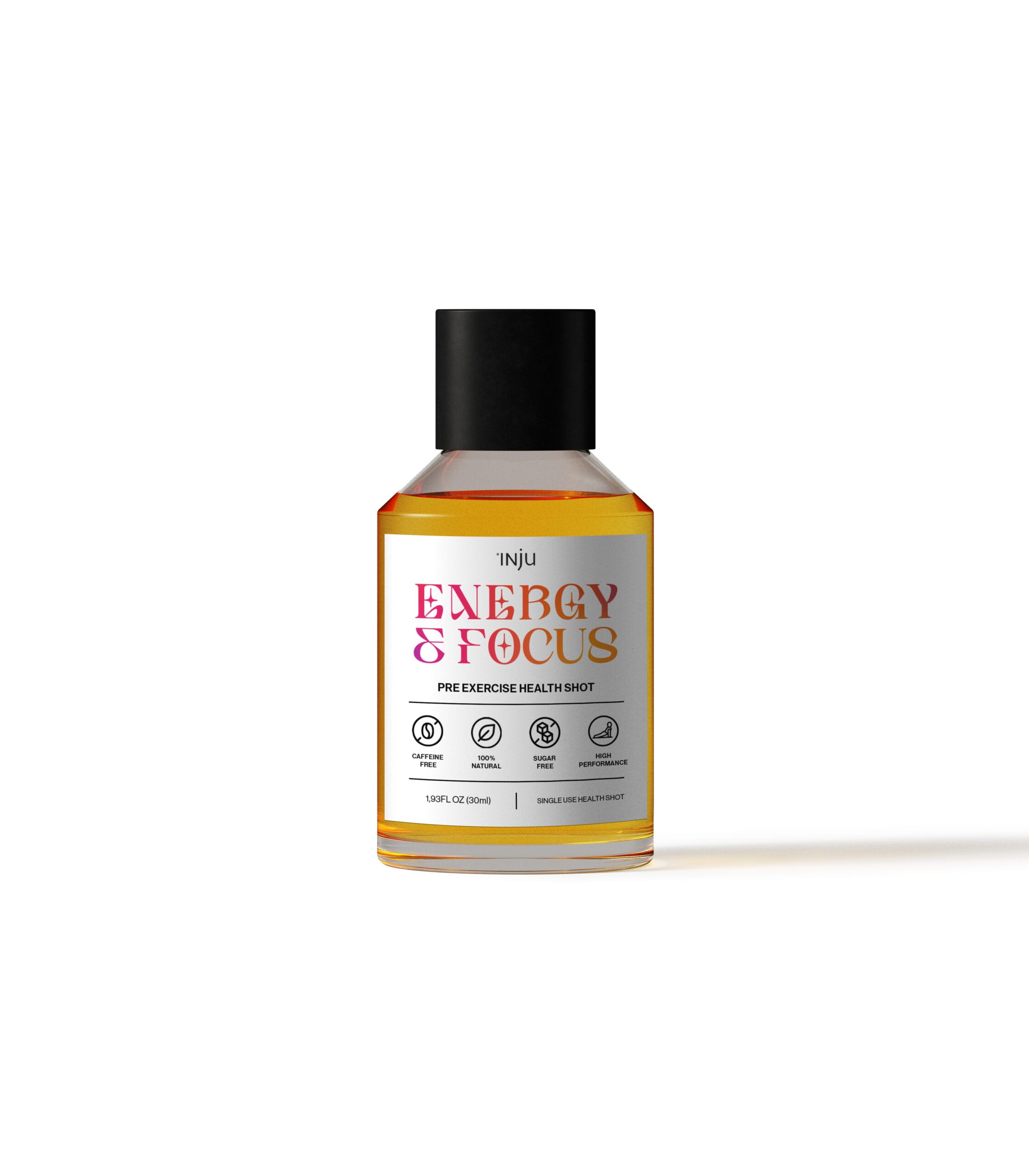
Reframing wellness through the lens of the inner athlete.
With the rapid growth of Pilates and low impact fitness, INJU identified an opportunity to evolve beyond general wellness and speak to a more active, design conscious audience. The challenge was to expand into performance and recovery without losing the brand’s foundation in natural, plant based health.
The rebrand introduced a more energetic visual language built around bold colour, clarity, and modern typography. Each product was designed to communicate its benefit at a glance, while still feeling premium and considered. The result positions INJU as a daily performance ritual for people who value balance, focus, and sustainable energy rather than extremes.
I led the conceptualisation and art direction of the rebrand, developing the visual system across packaging and supporting imagery. This included defining the colour logic, refining the typographic hierarchy, and shaping the overall look and feel to sit confidently between lifestyle wellness and fitness culture.