Protect theHeart of Africa
Scroll To Explore
Overview
Web Design
Interaction Design
UI/UX
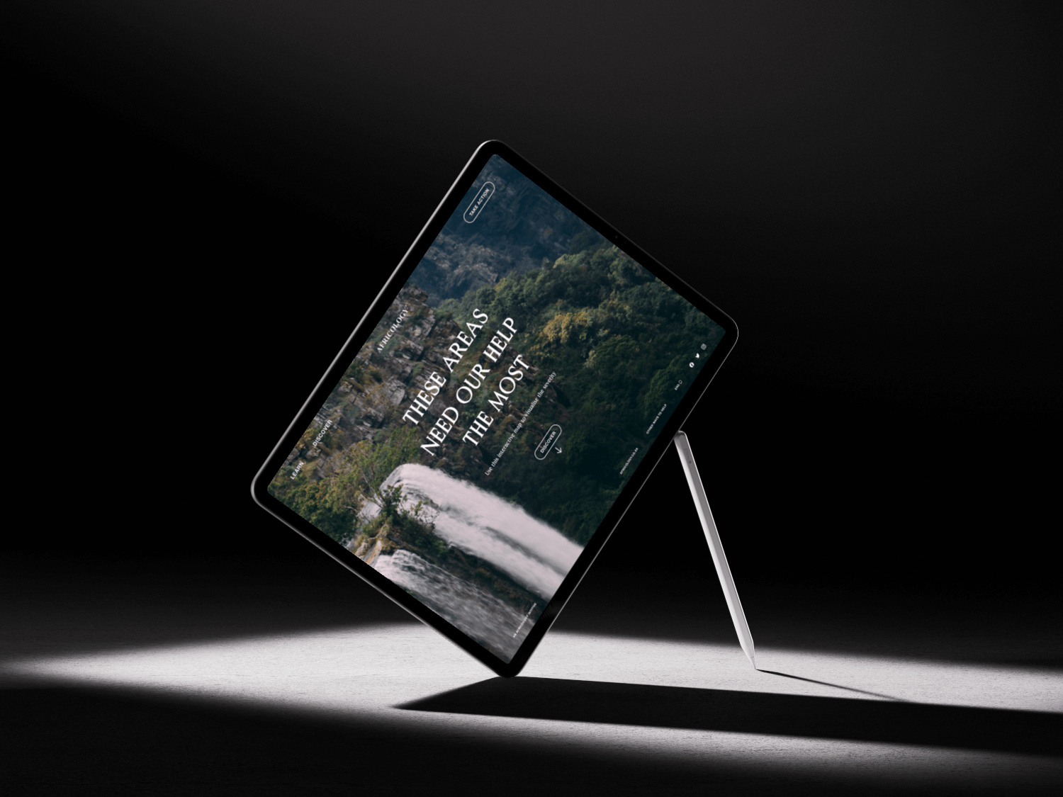
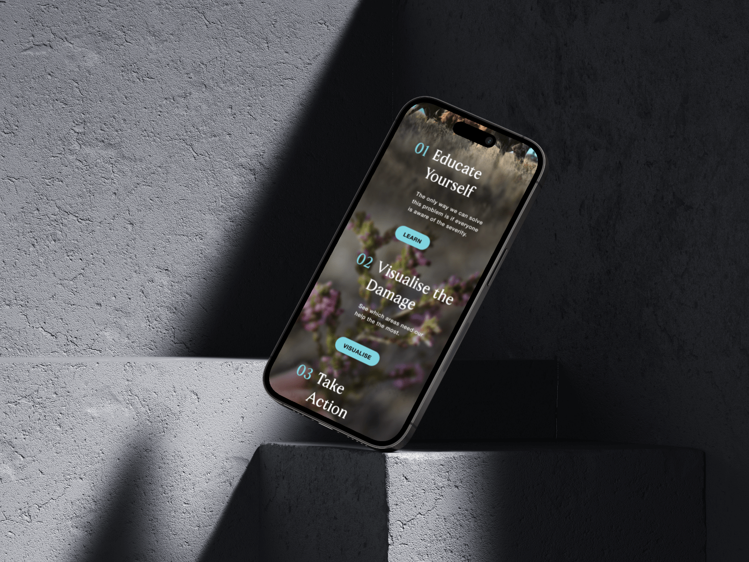
Protect the Heart of Africa is an interactive microsite that educates visitors on the importance of conservation, while aligning with and promoting the Africology brand.
Africology wants to generate leads and capture potential customers through a competition giving away free skincare products. Africology also wants to promote conservation, an important pillar in their brand. They need a microsite created that can achieve these goals, while ensuring a pleasant user experience.
Protect the African Heart achieves the goals set out in the brief, by using stunning and captivating imagery to visualise the beauty of the African wilderness and its importance to us all. The microsite positions Africology as a fighting force for the conservation and sustainable use of the continent's precious resources.
The Objective
To design and craft a intuitive user experience for the Africology competition microsite. This project targets Africology's existing user, this user experience should be supported by usable, efficient interactions and content that will achieve Africology's marketing objectives, by promoting conservation, and build positive brand loyalty by giving away products to the consumers.


The Concept
Protect the Heart of Africa
This concept stems from the insight that raising
awareness and educating people about a topic they care about is a
good way to connect a brand to its consumers on a deep level. The
natural environment and the wildlife that inhabits it is seen as the
"heart" of Africa, because it so essential that life cannot function
without it. Africology is very passionate about conservation, and our
insights show their consumers are too, and what a better way to
connect the consumer to the brand than through a shared interest:
conservation.
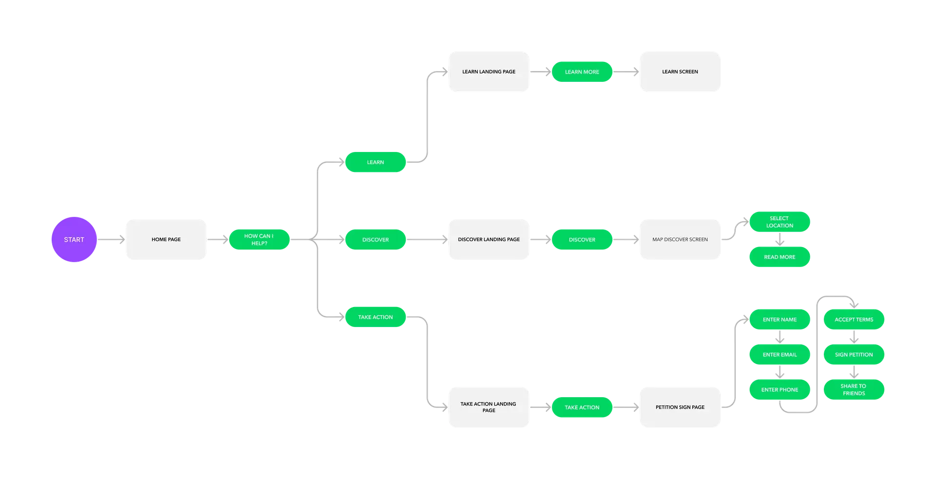
The User Flow

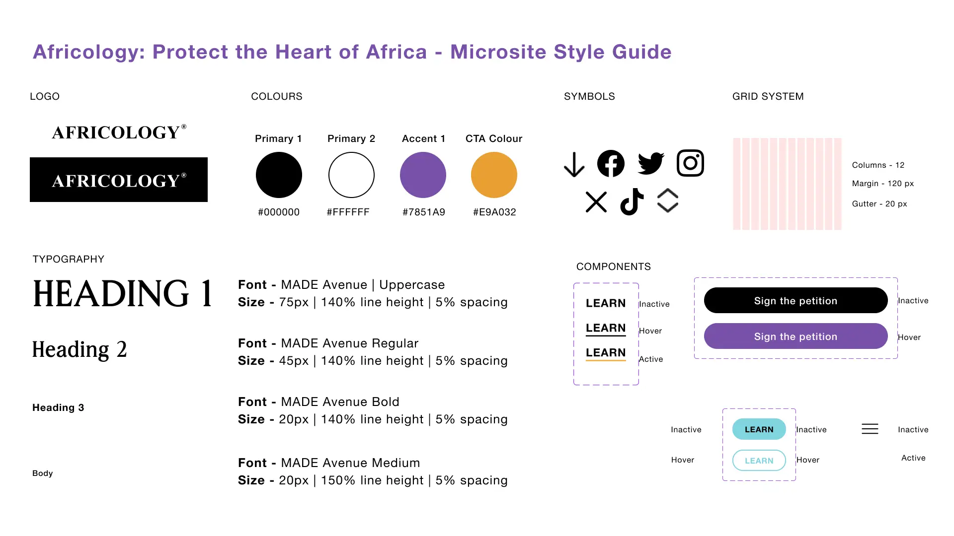
The Style Guide


