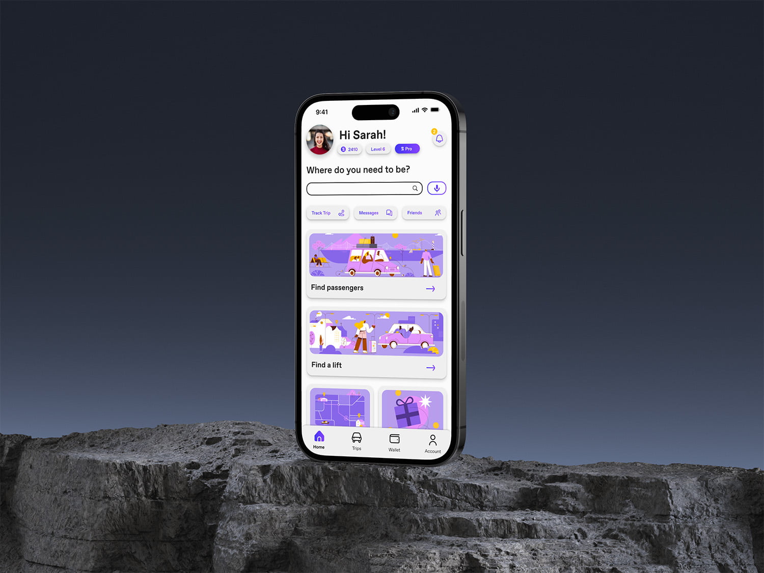
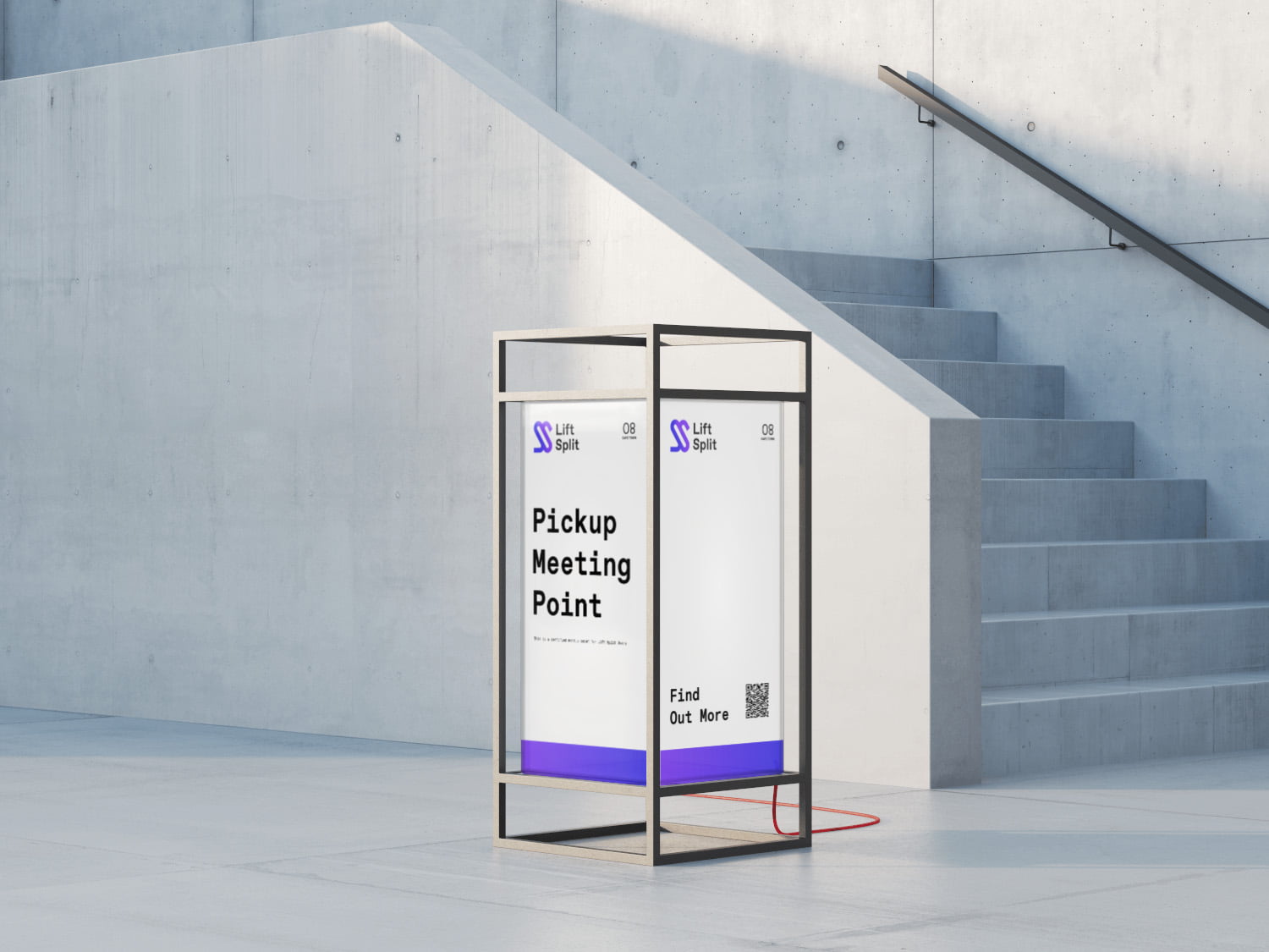
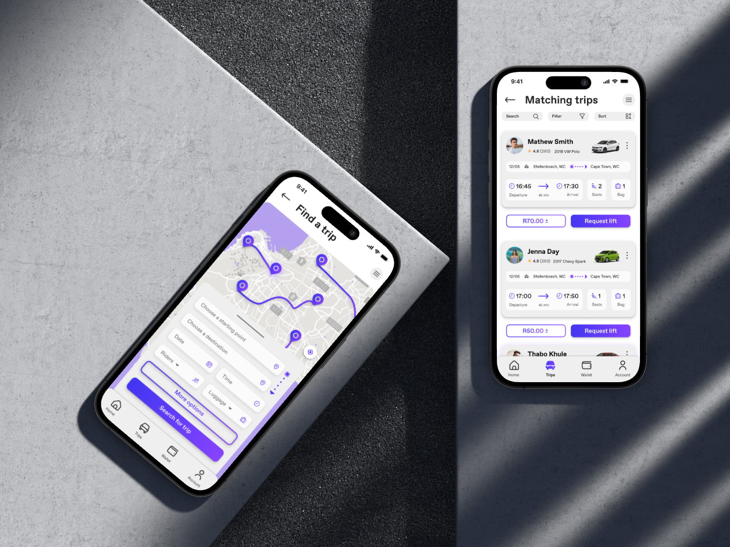
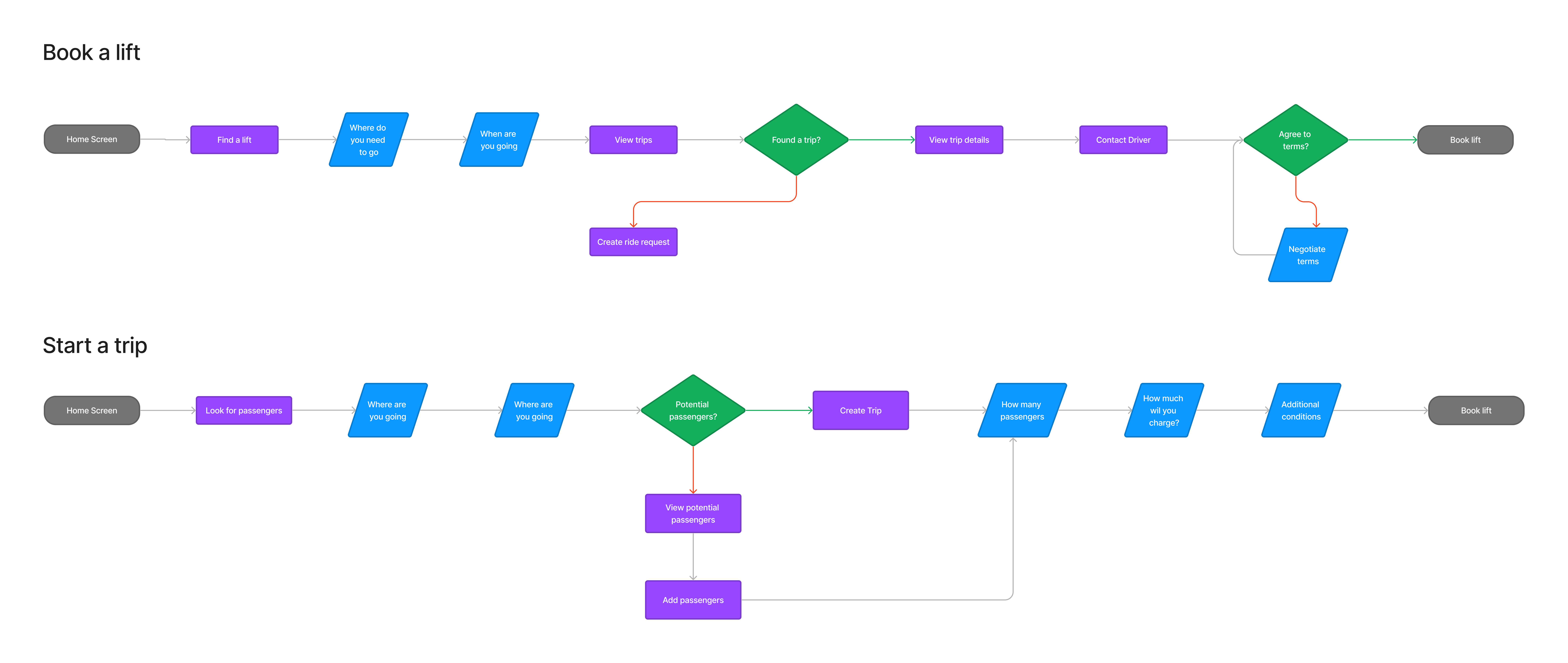
Lift Split is a ride sharing platform that connects drivers and riders both going to the same destination, saving both parties money.
The aim of this project was to develop a transportation solution, designed to bridge the gap between the high costs associated with private vehicle ownership and the limitations of public transport. The platform focuses on affordability and convenience, catering to both individuals with their own vehicles and those without, by facilitating cost-effective shared rides and fostering a community-driven approach to transportation.
Lift Split was meticulously crafted with a strong emphasis on user friendliness and optimal user experience, driven by extensive real UX research. Every aspect of the app, from features to design, was informed by insights gathered from users. The result is a seamless and intuitive platform that caters to the specific needs of its audience, ensuring a user-friendly experience at its core.
The Problem
The price to get around is expensive for people with their own transport, while people without transport are often stuck in a middle ground between public transport and e-hailing services.


The Objective
Create a platform that connects drivers who are already traveling to a destination, to riders who need to get to this destinaiton.
The Concept
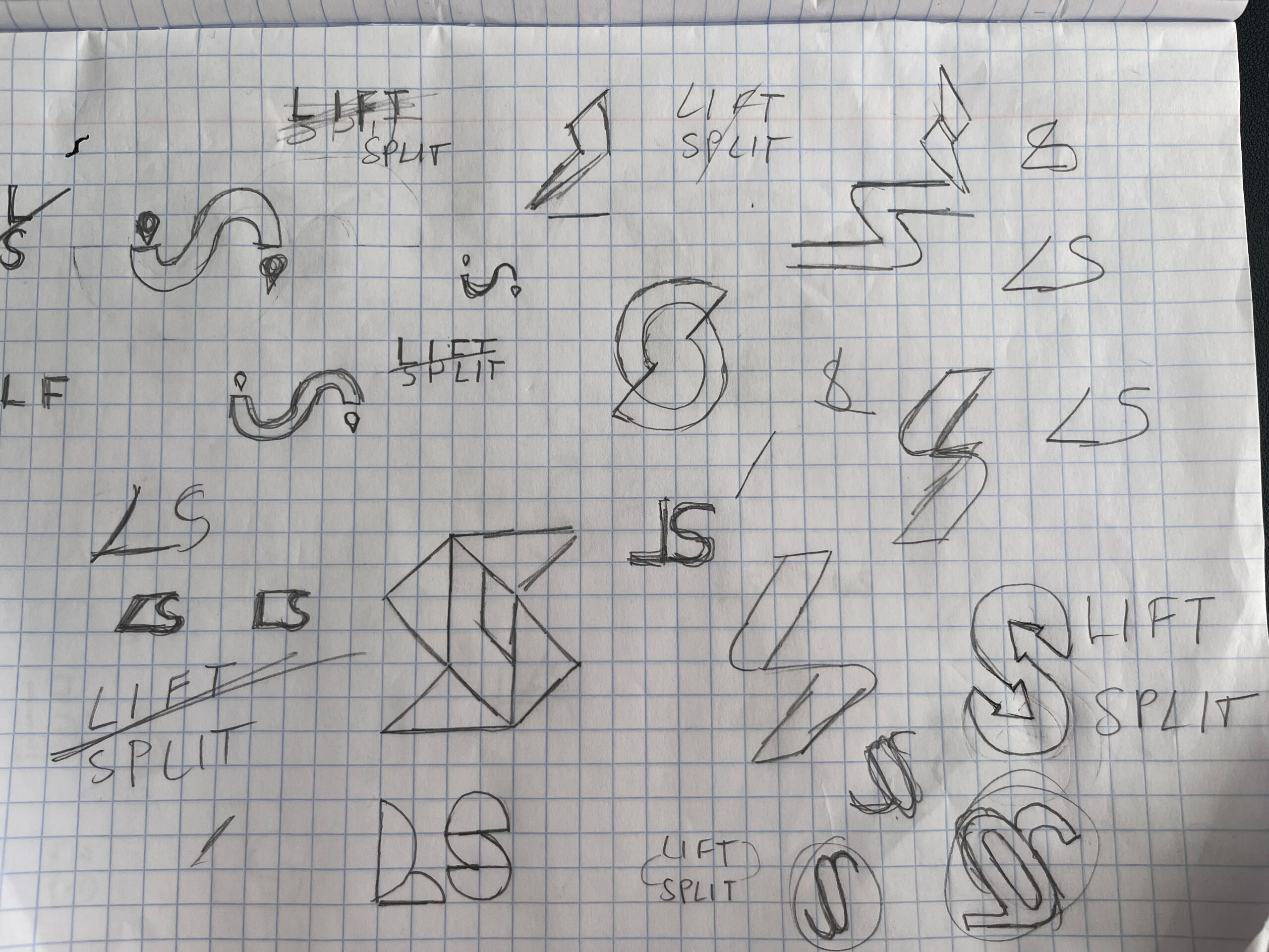
Lift Split
Split the Lift, Share the Journey
User Research
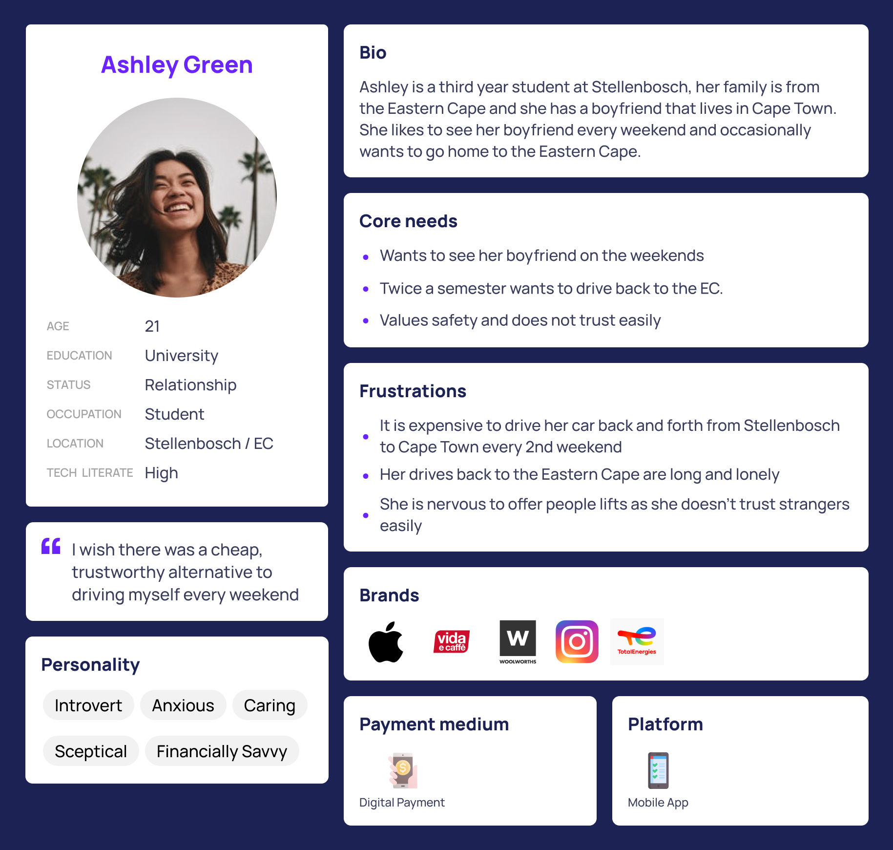
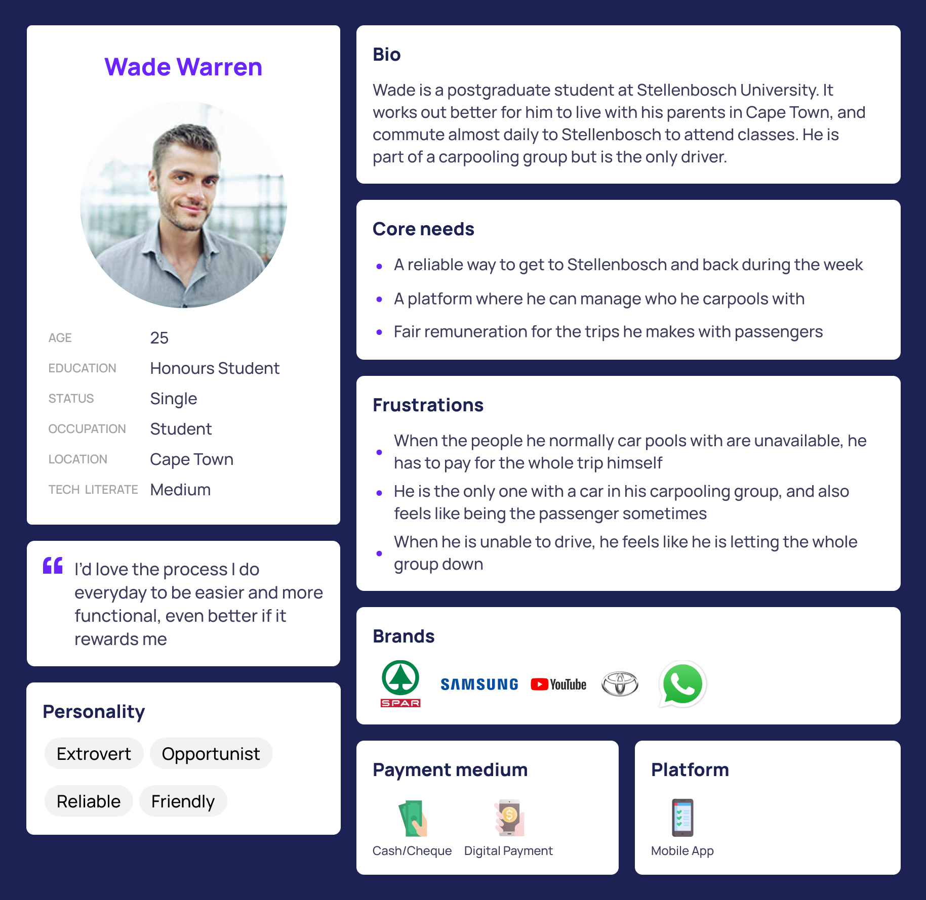
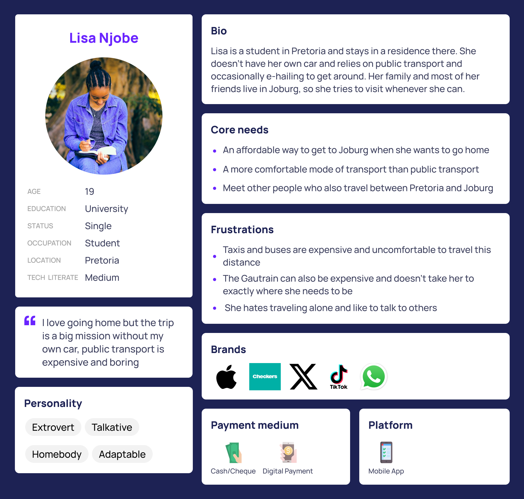
We conducted an online survey which was circulated amongst our determined target audience, young students, which gathered a good mix of quantitative and qualitative data. This data allowed us to reach the following insights.
Pain Points


